This is an excerpt from the Book called “The Paint Effects Bible 100 recipes for faux finishes“ by Kerry Skinner. Continue reading to learn more about Color Theory, thanks to the author.
Color is amazingly expansive as a subject. Indeed, it is possible to become involved with color and combinations of color endlessly before even beginning to deal with the structural, textural, or figurative elements of project. This makes it necessary to have a focus and to ignore the dictates of fashion and fad that can distract you from your personal vision. If you have a complete understanding of logic of color theory you can choose colors to work with that could stimulate, soothe, or enhance your enjoyment of home, work, and life in general. Learning the simple rules means that you can then adapt, interpret, and break them to suit your own aims.
The use of color is a skill that needs to be learned like any other: an understanding of the color wheel and its potential and value is essential, as is an appreciation of the relationship between colors and their combinations. As an element of form, color is a major influence. It can arouse appreciation and stimulate more thoughts and feelings than any other aspect of interior design.
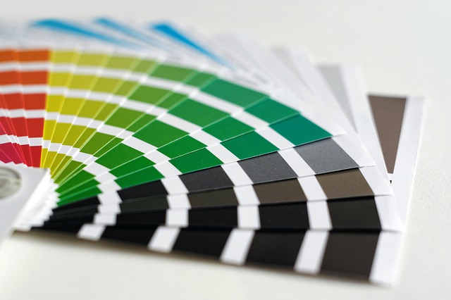
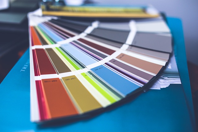
The color wheel
The color wheel as a basic reference is an invaluable tool when learning about color. The bands of color- red, orange, yellow, green, blue, and violet- are arranged in a segmented circle to show their relationships more effectively. Red, yellow, and blue are known as the primary colors. Mix together two of the primary colors and you will create one of the secondary colors- red and yellow make orange, yellow and blue make green, and red and blue make violet.
Mixing equal parts of primary and adjacent secondary colors will produce tertiary colors. For example, red and violet make crimson, blue and green produce turquoise, and yellow and green create lime.
Hue, value, and intensity
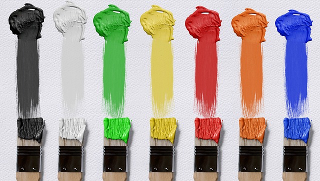
A particular color can be defined by referring to its three qualities: hue, value, and intensity. Hue is the specific spectral name of a color, such as red, blue, or yellow. The color “pink,” for instance, is a “red” hue.
your own paint colors it is often better to use burnt umber rather than black. A sense of tone can easily be viewed on the color wheel, where yellow has the brightest tone and violet the darkest. Red and green, however, appear similar: they have a similar tonal value, which is why they can be mistaken as the same by someone with red/green color blindness.
Value refers to the darkness or lightness of the color and includes tints, shades, and tones. Tints are created by adding white and shades by adding black-although for a more subtle shading when mixing
Intensity refers to the saturation of color- its purity, brightness, or dullness. A color with high intensity is bright, strong, and clean, as opposed to one that is muted, dirty, or dull.
Color scheme considerations
Once color is used in a practical way, one needs to take into account not just the individual qualities of each color but also the relationship of combined colors. The mood you create will depend on these combinations.
Calm and restful schemes will be produced if analogous/adjacent hues on the color wheel are used. This is because these colors are harmonious and close in character, as opposed to complementary colors, which sit opposite each other on the color wheel. Combined complementary colors can be very busy and distracting. However, using a small amount of a contrasting color within a single-color scheme is a simple means of achieving an interesting balance.
Combining neutral tones, such as black and white, black and yellow, or blue and white, or clashing primaries against white will create a dramatic impact.
The positioning and amount used of each color can suggest a color is advancing or receding: bright, warm colors tend to advance while dull, cold colors recede.
Warm or cool colors can illicit an emotional response. Red is associated with passion, action, and danger; orange with vibrancy and health; yellow with happiness, warmth, and sunshine. By contrast, blues suggest space, coolness, tranquillity, and melancholy. Our emotional response to different colors is also closely linked to their environmental associations. For example, green suggests growth and is refreshing and cooling. Brown suggests earthiness and harmony. Purple is the finite color combining warmth and coldness, distance and closeness, and is often viewed as inspirational, religious, and soothing.
External considerations
The balance of light, colors, tones, and textures must be considered carefully in the planning of any project. For example, the textural finish of an applied color will affect how it is viewed. A matte or rough surface will seem darker than a shiny, glossy one, due to the difference in reflected in light. It is therefore important to have these practical considerations in mind when choosing the application of color, in addition to the aesthetic, subjective reasons. Smooth finishes are more appropriate for utilitarian kitchens, whereas texture is probably better in an area where you want to suggest softness, and comfort, such as in a reception room.
Consideration must also be given to the source and the quality of light available. Daylight and artificial light affect colors very differently, so view paint samples in various conditions to see how the color changes. Halogen bulbs issue a whiter light than ordinary household bulbs, while natural light varies with the seasons and all light is affected by the choice of curtains and lampshades. Metal, glass, and mirrors can all be used and reflect and diffuse colors and light.
Understanding paint
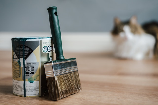
The application of paint is the quickest and easiest way to add color to any environment. Paint contains two main ingredients: color in the form of pigment and/or dye and the medium that carries the color, whether water, oil, and/or a blend of synthetic resins and plastics. Manufactured binders make paints tough and easy to use, but their manufacture encourages the use of non-renewable resources. As the processes of decorative painting become demystified, the traditional techniques such as limewashing, distemper, colorwashing, and simple plastering are becoming more widely used. It is hoped that more environmentally friendly products using organic pigments, blinders, and solvents will become more readily available.
Mood/color boards
When you are in the process of deciding on a scheme it is a good idea to begin with reference point. This could be a painting, postcard, photograph, or a favorite object, color, or fabric swatch. Once you have gathered a number of reference materials, the best way to organize them is to create a mood or color board. Combine all the elements you wish to work with on a large piece of thick paper or card. Try to keep the samples in proportion- so if you have a large area of flooring or if the wall effect will be a backdrop to smaller decorative items, aim to display the board with smaller pieces against the larger effect. Try out various sizes of pattern where possible- example, by photocopying the originals at different scales.
It is important to assess each board against various light sources, to avoid any unnecessary surprises or disappointments. It is also recommended that you paint up a piece of board or lining paper with the same base color and texture as the actual surface, then experiment with paint in washes, textures, and depth of color. Finally, view these samples in the light source you have decided on.
With such careful preparation and planning undertaken, when it comes to the real thing he work should be spontaneous and relaxed.